
Look at the game on
SteamEinar
Einar is a single-player 3rd person hack and slash game based on Norse mythology. The challenge was to create a near-triple A quality experience.
- UI Designer & Developer
- Team of 30
- 16 weeks (2017)
Look at the game on
SteamEinar is a single-player 3rd person hack and slash game based on Norse mythology. The challenge was to create a near-triple A quality experience.
The steps I took to get to the final result
The 'Einar' project had a duration of one 32 weeks in total (holiday's and breaks not counted). Of those 32 weeks, 16 were fulfilled as a Technical artist, the other 16 as a UI Designer/Developer. During the break from UI development, Unreal Engine had improved and changed, as had I. In addition, a personal goal of mine was to become more efficient in UI development with Unreal Engine. All reasons considered, It was necessary to do an 'Unreal Engine Recap': going through the engine documentation; making test projects and updating my knowledge.
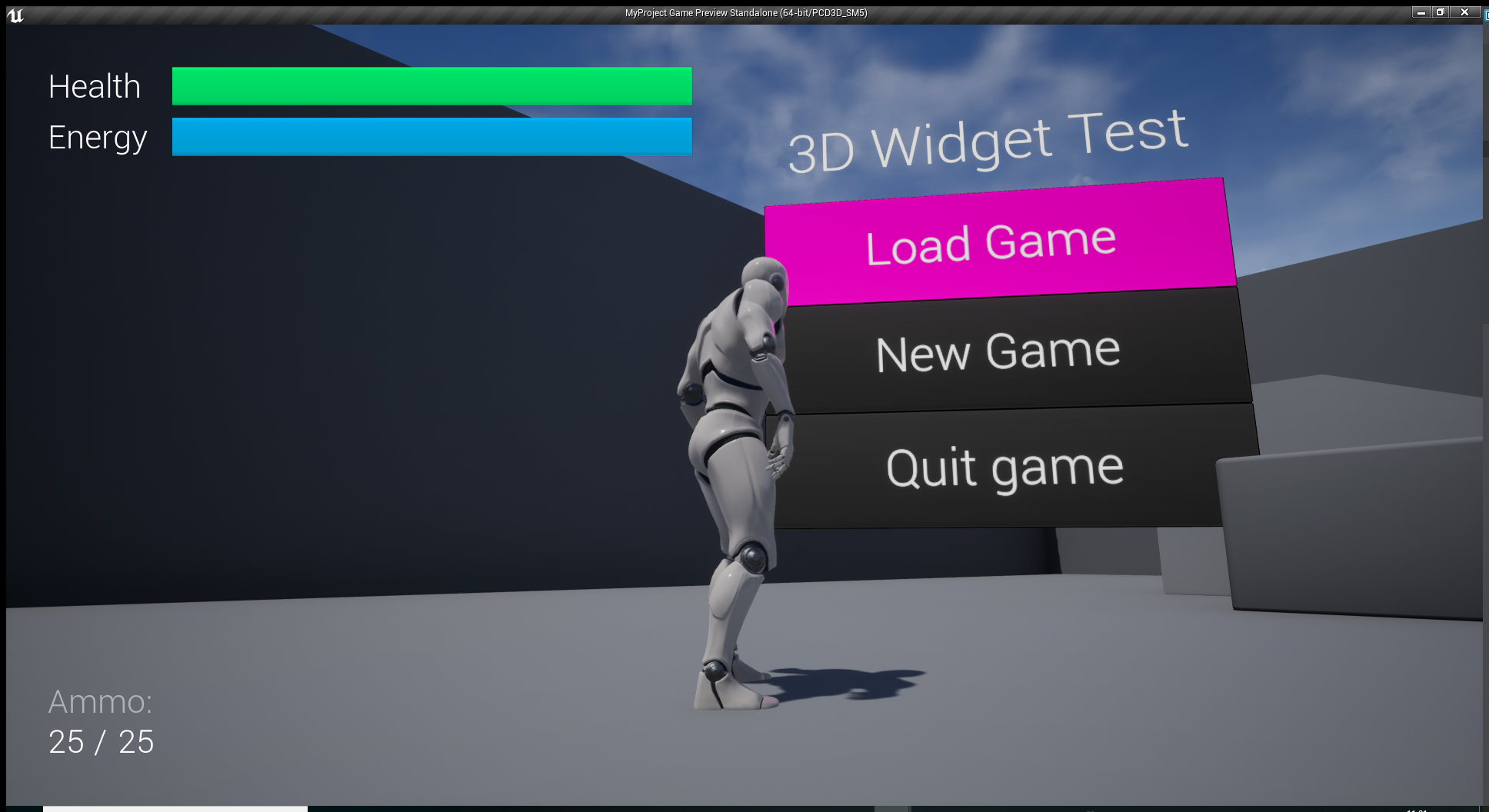
Important subjects of this recap were: New pipelines in widget development. (From eyeballing in older projects; to working with paddings margins and boxes after some experience with web development projects; to finally working with a mixture of both.), different ways to update a menu, creating and using widget templates and exploring the new way to create interactable 3D widgets. Some of these subjects are displayed above.
The original plan for the UI development on Einar was to spend the weeks one and two on gaining knowledge about UI Design and UI development in Unreal Engine, building the first menu prototype in week 3, taking week 4 and 5 to do visual research and make the art for the menu, week 6 would be spent on implementing that art and improving the prototype and the weeks after that were for animation, polish, bug fixing, user testing and overdue tasks.
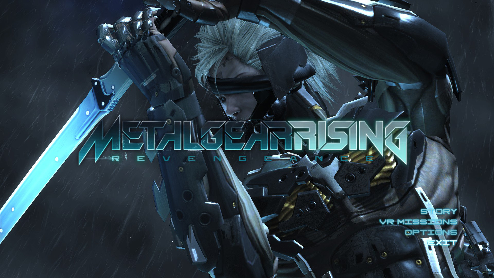
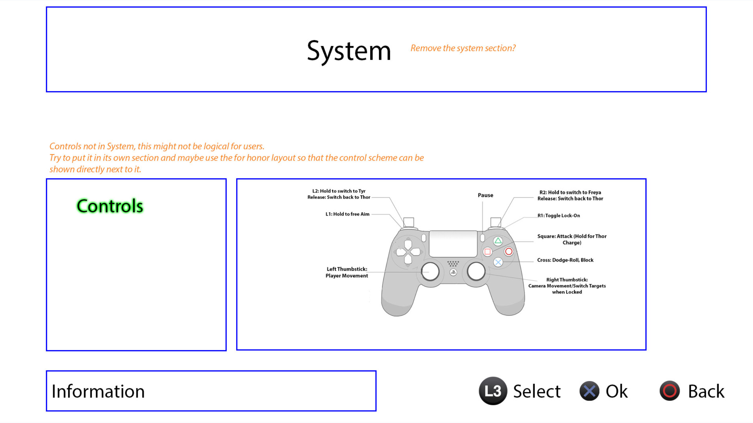
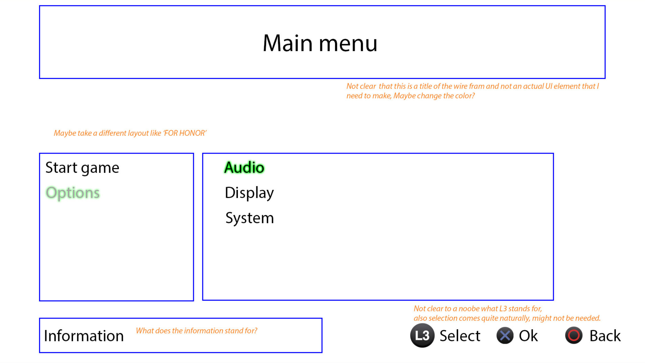
The UI designer of the team would provide wireframes and a visual reference for the menu. The visual reference was MetalGear Rising, displayed above together with the wireframes that the UI designer provided (feedback notes are written in orange).
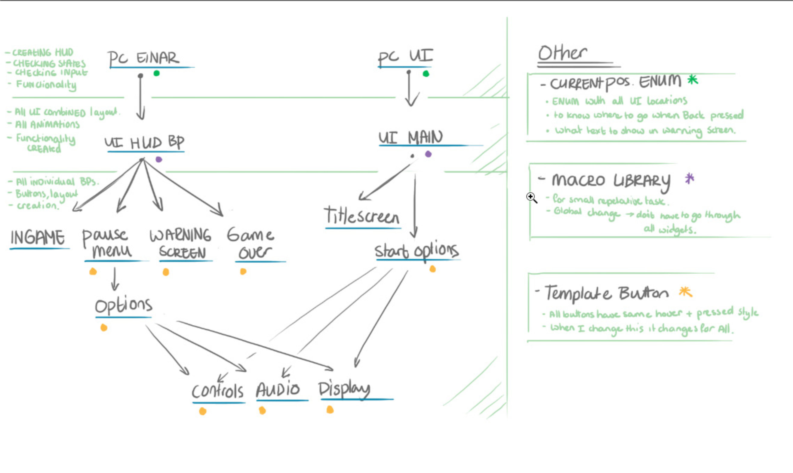
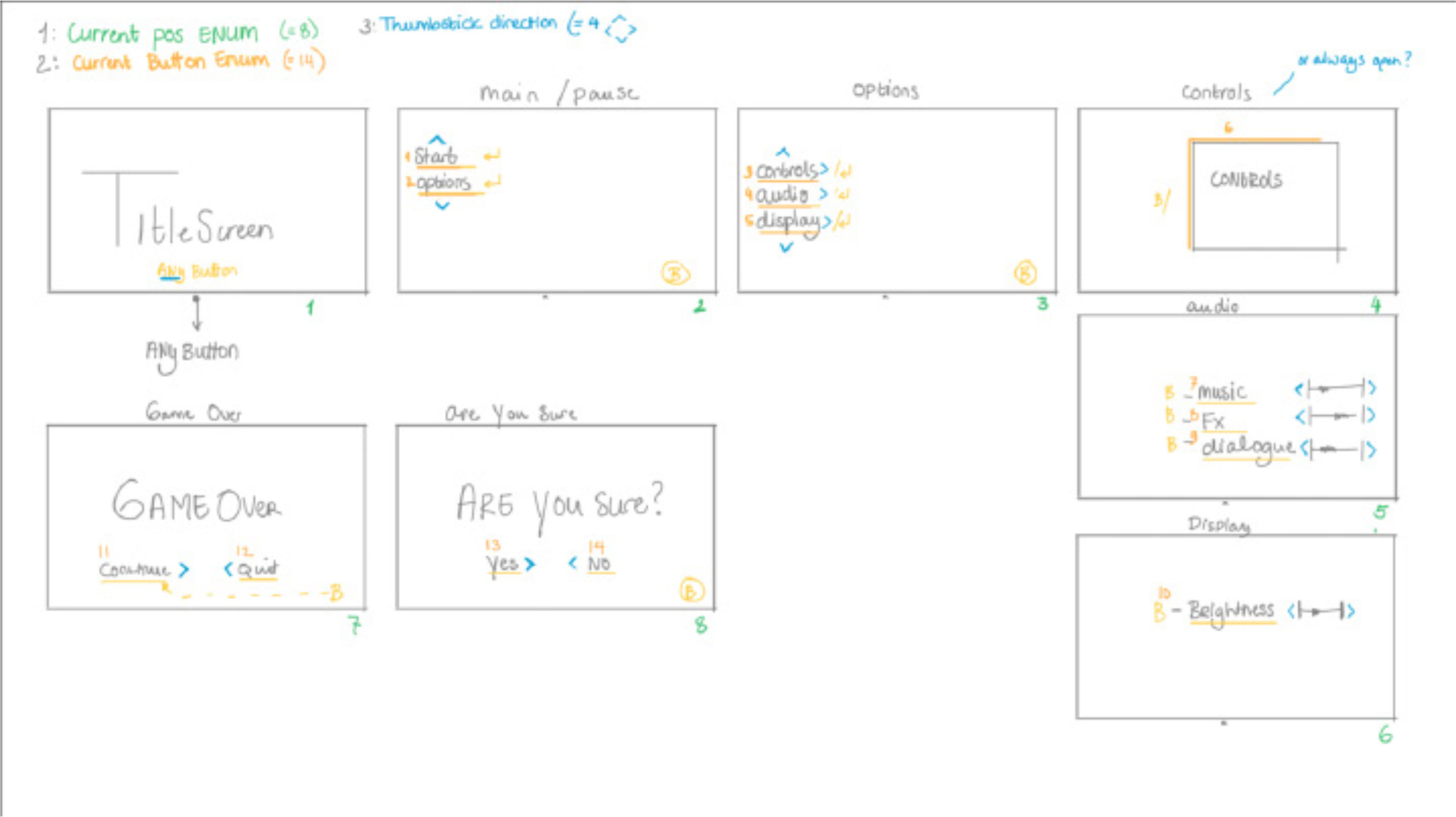
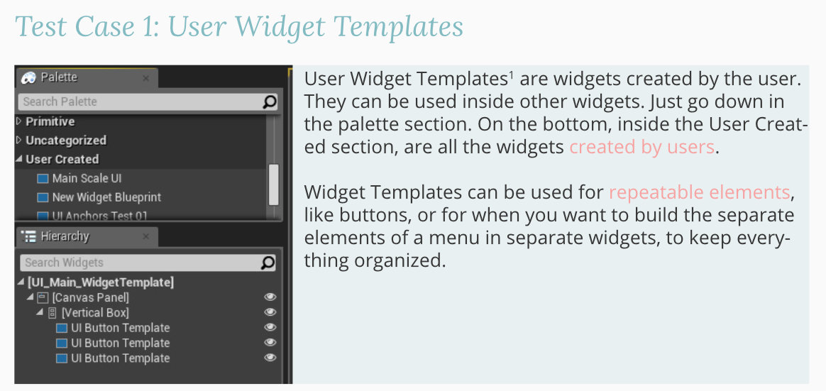
Before the actual production of the prototype, sketches were made to explore and narrow down the technical set-up and flow. A goal was to make the prototype as modular as possible. Building user template widgets for reoccurring elements like buttons and the options section. Moreover, exploring the possibility to use a library for reusable pieces of code.
The second image displays a sketch in which the UI flow and possible navigation are drawn out. In these sketches, all the possible movements in the menu are thought out. When the set-up of the menu was clear, the first prototype was created.
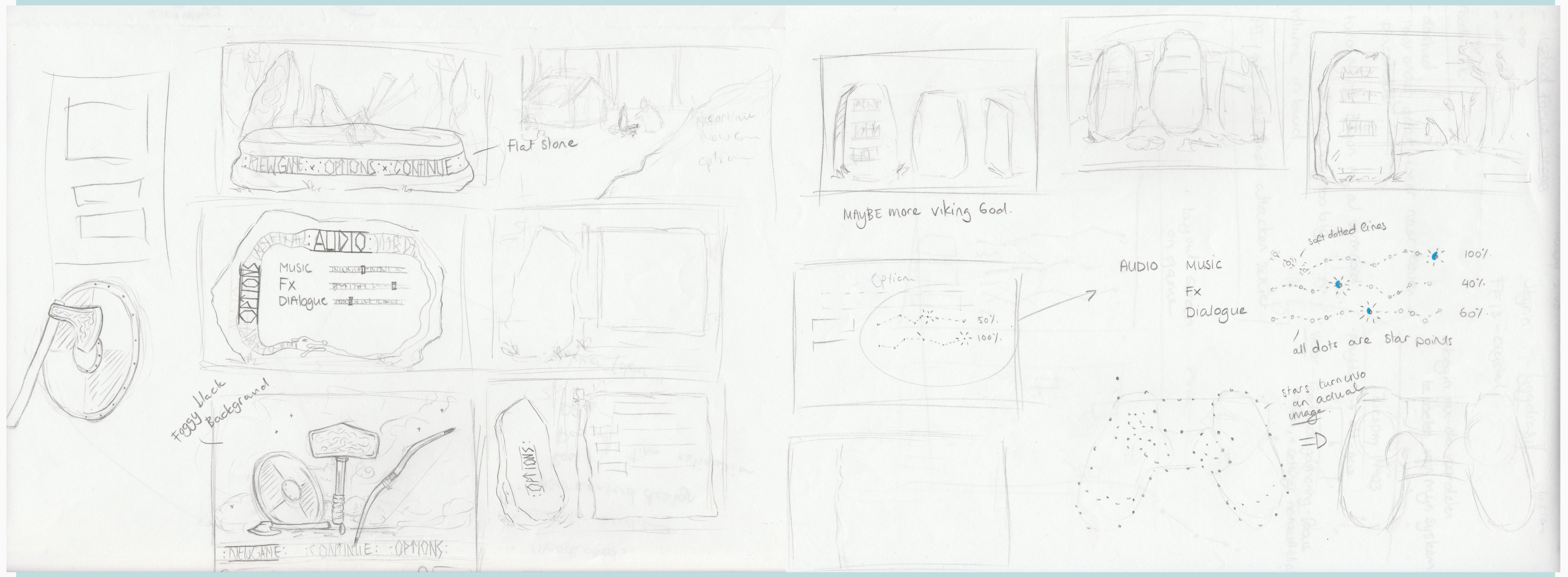
After the creation of the first prototype, it was time to go back to designing the menu. However, the UI designer of the team had a lot of other roles and couldn't work on the UI anymore. Furthermore, there wasn't a lot of enthusiasm for the original menu idea, the main negative being that it was too cliche Viking. The decision was made to go back and rethink the menu designs.
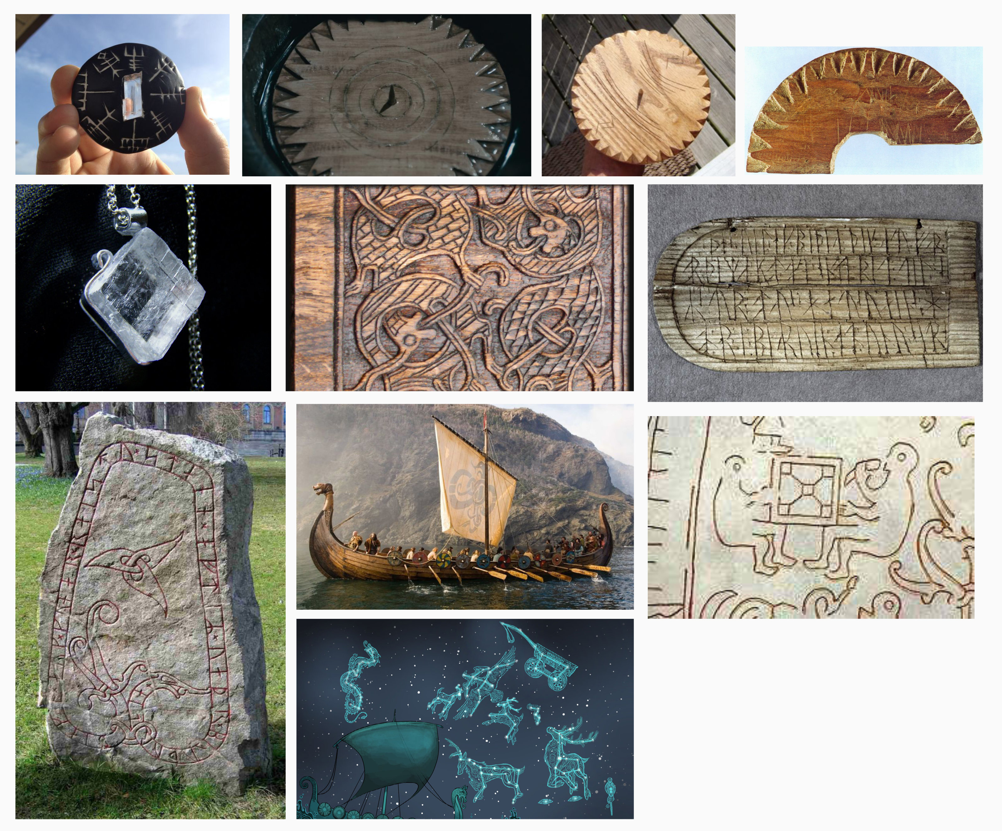
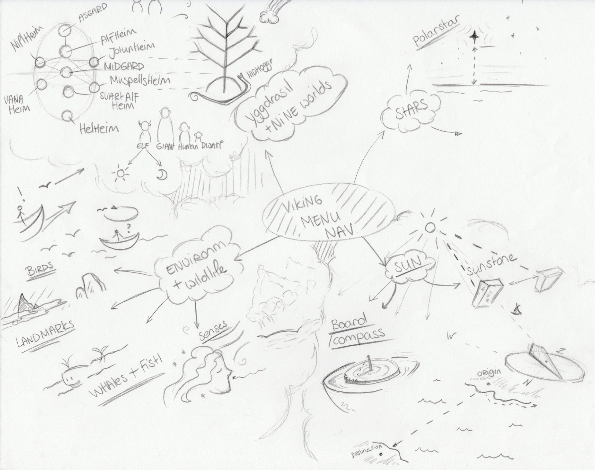
The first step was research into Vikings, to give a Viking essence and feel to the menu, without being obvious. The general research was conducted in addition to more specific research into Viking navigation. From the research findings, a mind map was created together with a lot of sketches for menu ideas. Though, in a later review, the Sketches and idea's were still considered too superficially Viking.
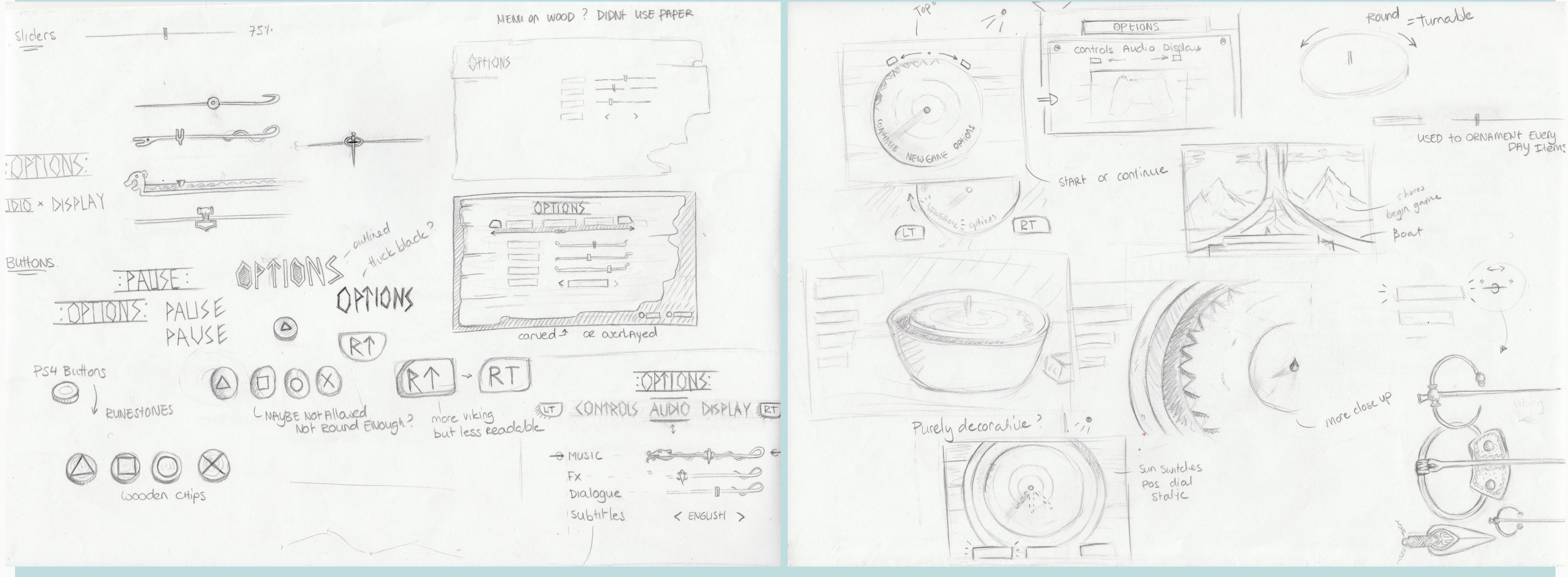
Some brainstorming was conducted to change the ideas from literal to abstract. For example. The Vikings used birds to find out if they were close to land. When they weren't close to land, the birds would circle around the ship. When the Vikings got close to land, the birds would fly straight to the land. In a basic literal level, you could include this in your menu by adding birds. But on an abstract level, you include it by adding the motion. When the user hasn't made a decision, he/she circles through the options. When the decision is made (clear) the menu might float away in a straight direction.
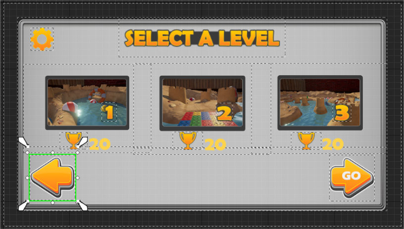
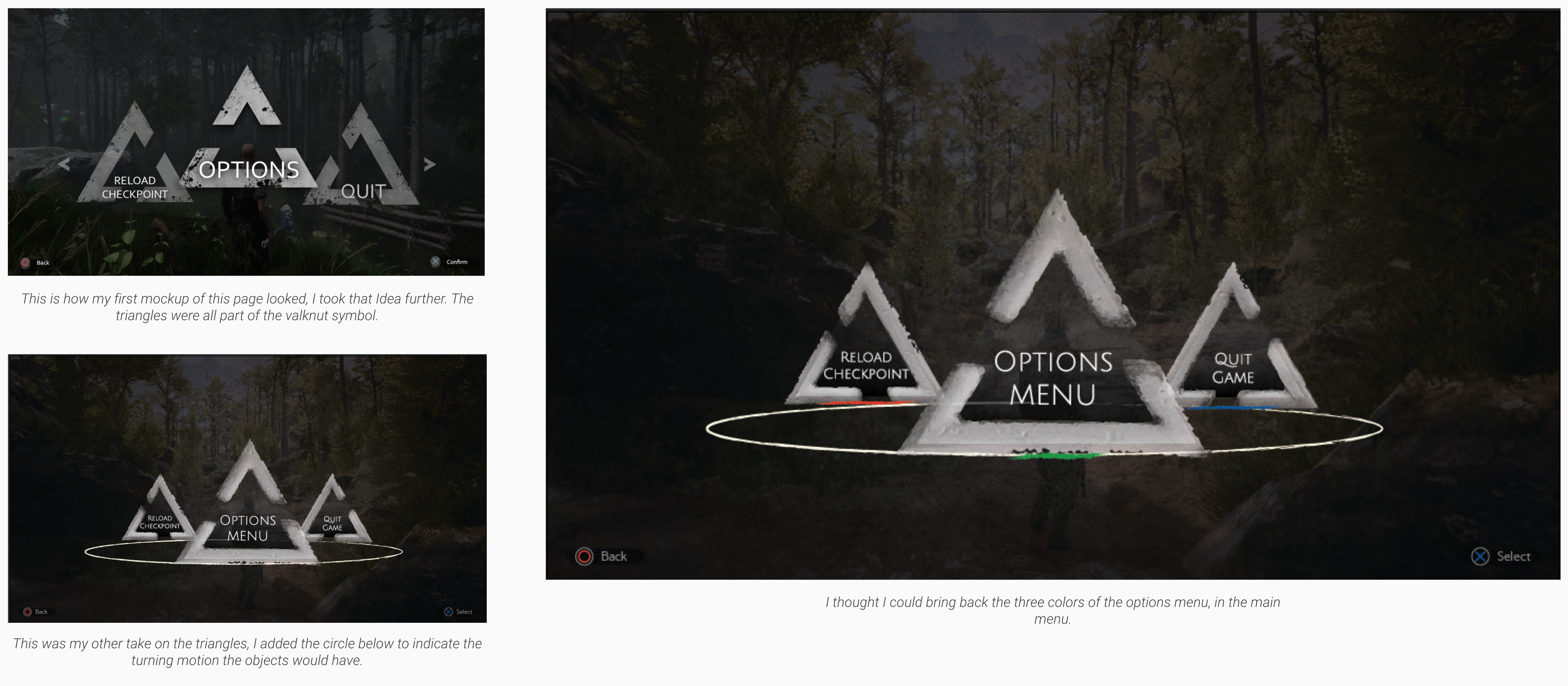
After the brainstorming, two ideas were most prominent. First off, the circle movement as explained before. Secondly, the number three. Three gods, triangles, triangle composition (a divine hierarchy), three colors, three options etc. In the game, Einar, the main character, gets help from the gods. In the menu, these gods have a prominent role in the design. With these new abstract ideas, Wireframes of the menu were created. These wireframes were used to create a mock-up.
With the new design idea approved, the prototype was updated to reflect the wireframes.
After the creation of the second prototype, the project had a short break.
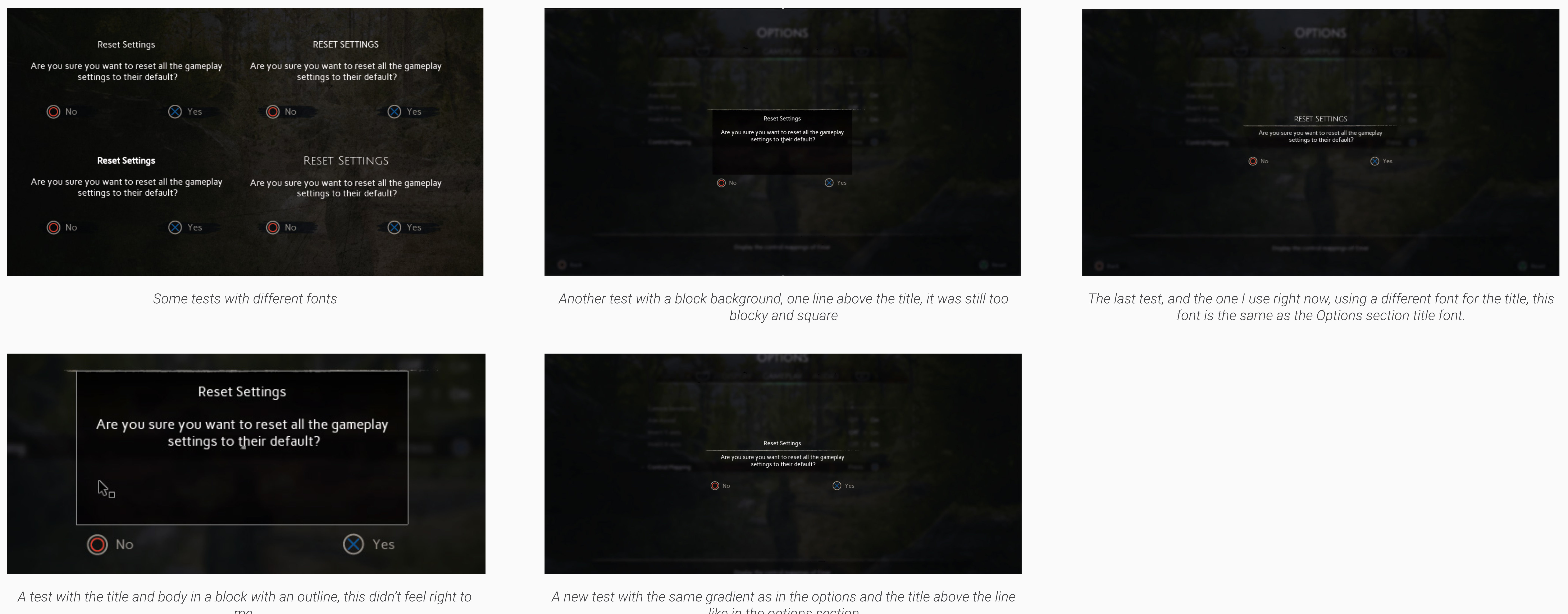
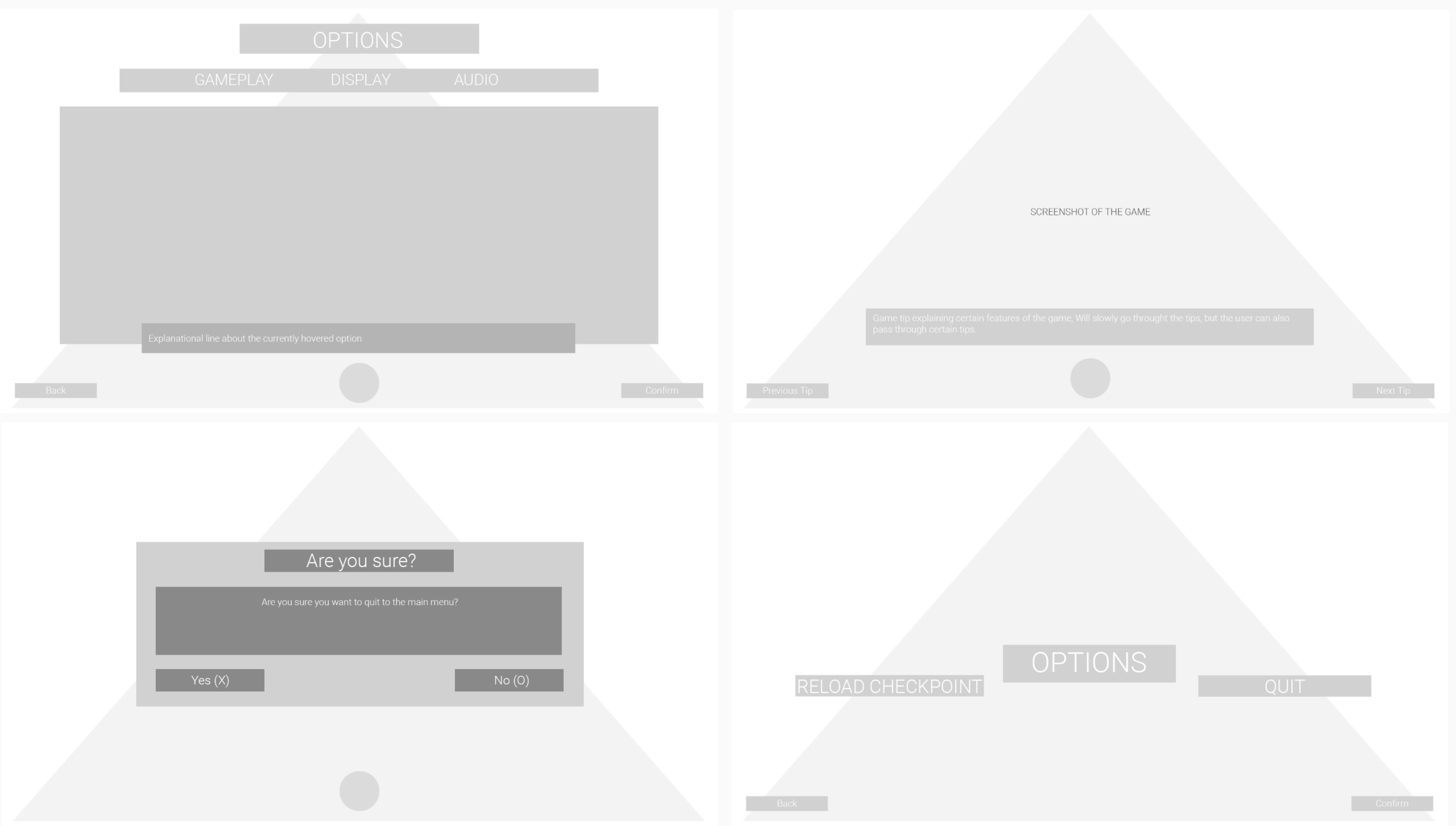
After the break, it was time to review the mockup. The old mock-up didn't meet the standard as it wasn't a realistic enough visualization of how the menu was going to be. Additionally, the mockup only showed the first window of the menu. It was necessary to create a mock-up for each window/part of the menu. Everything was scaled down and rearranged. Different fonts were researched until the right fonts were chosen for both the headings and the texts.
The slick and clean look of the design together with the silver and gold colors represents the divine element of the gods in the menu, it gives a more classic feeling. Moreover, the colors that are implemented in the menu (blue, red, green) are the colors that represent each god in the game. The grunge on some of the lines, the darkness and scratches in the background, the sharp hooked fonts and the strong (pure) colors give a more Viking touch to the menu.
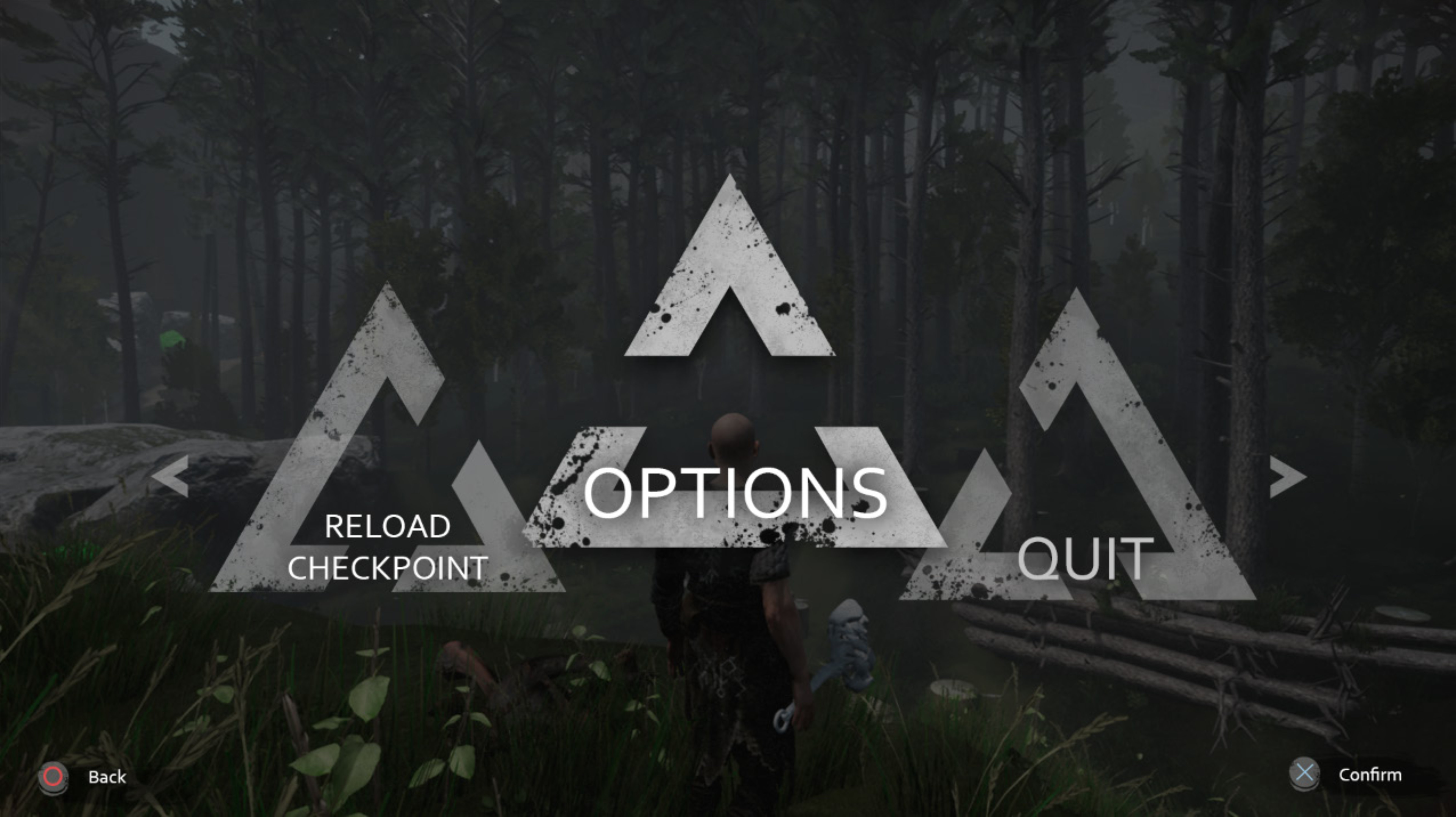
The team was enthusiastic about the designs and gave the green light. It was still necessary to build animation mock-ups before I started to implement the art into the menu prototype. Yet, the team-leads really wanted the new art in the game.
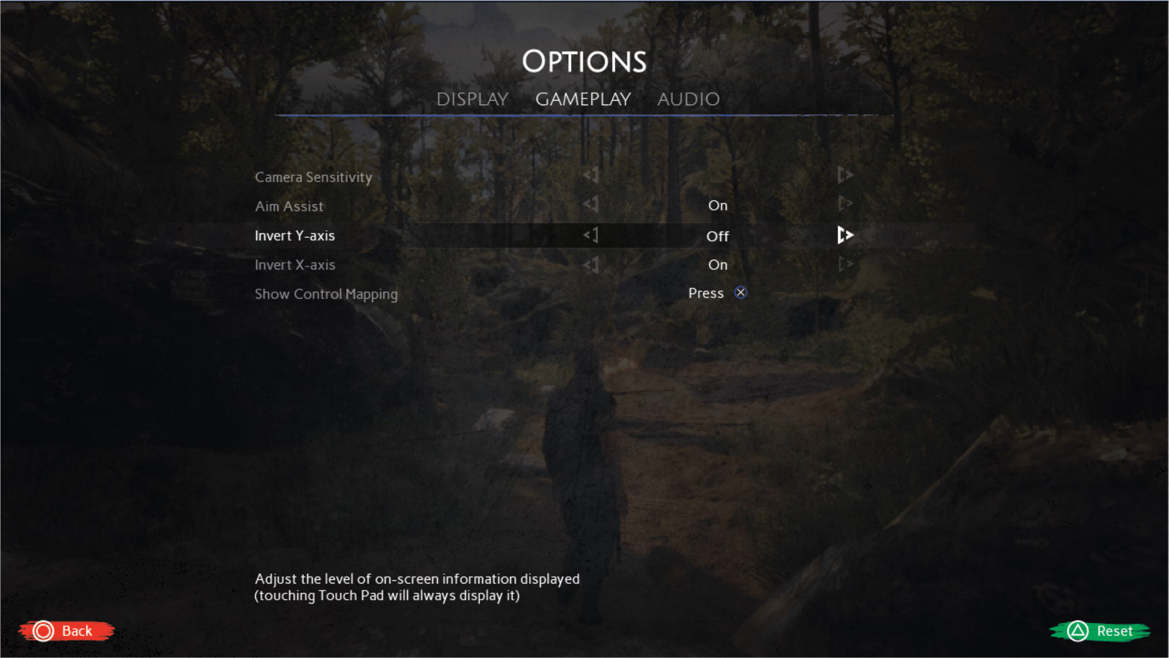
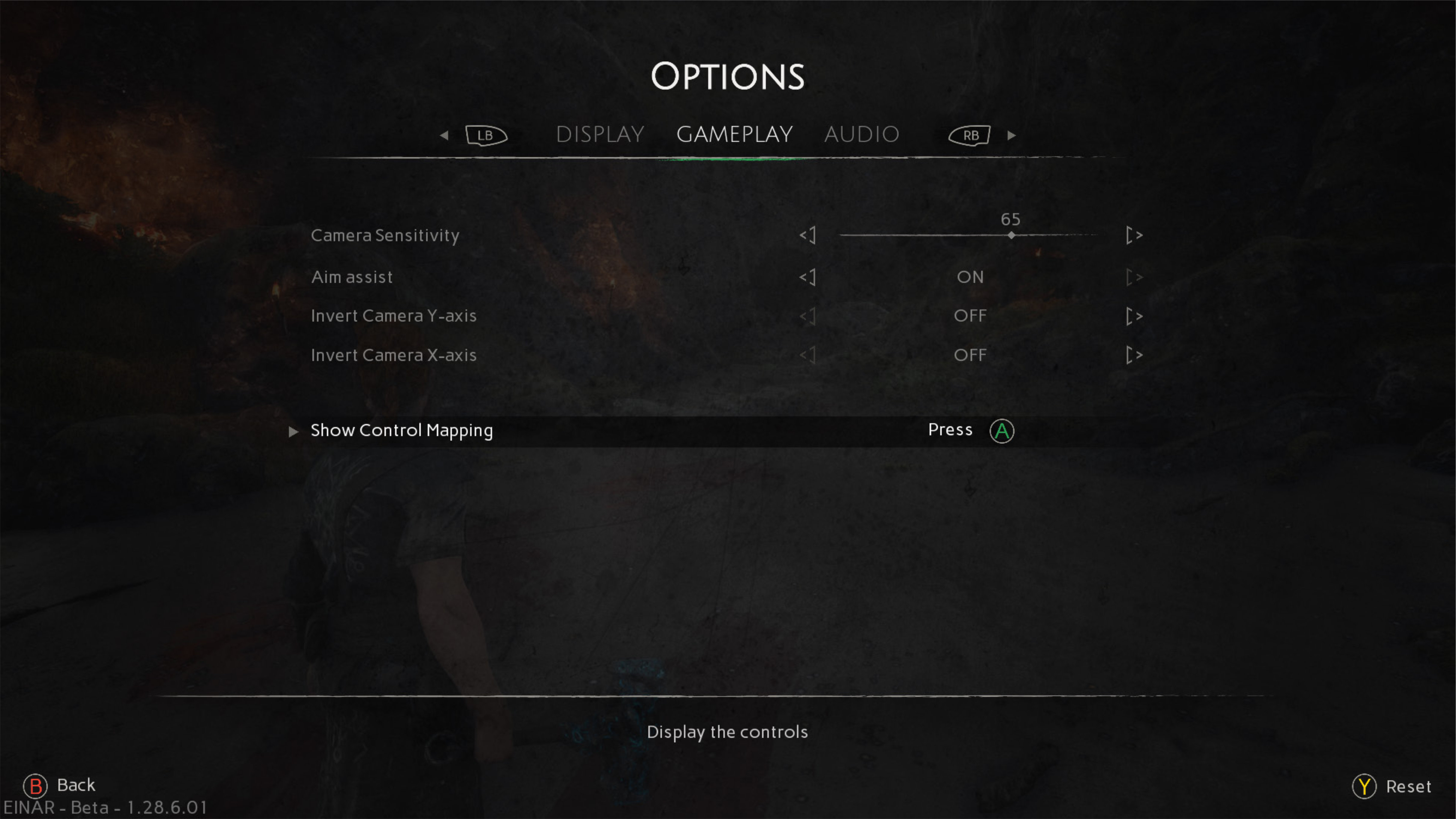
After a meeting, it was decided to first get all the new art nicely into the game and to continue with the animation mock-ups after the menu was functional with the final art. The first image shows the mock-up of the gameplay section of the menu. The second image shows the in-game version of that section.
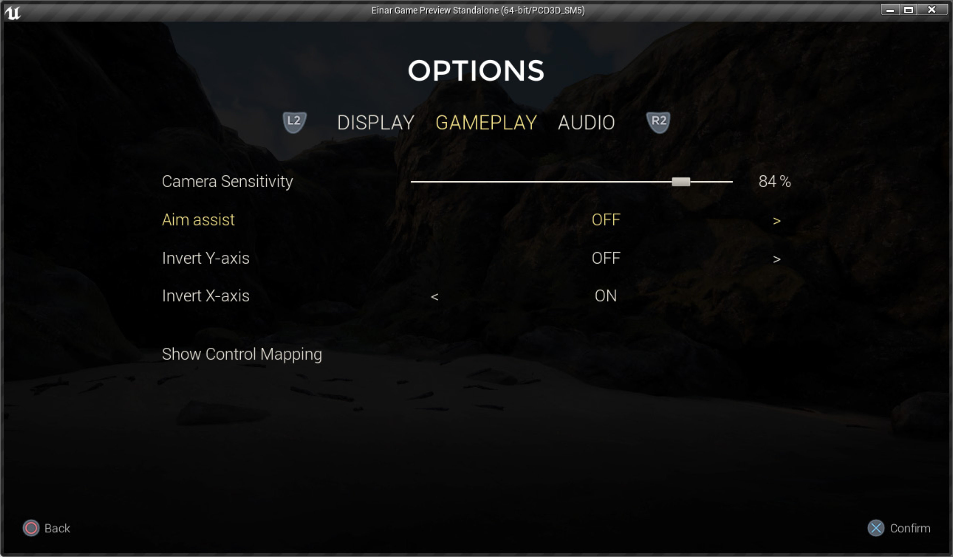
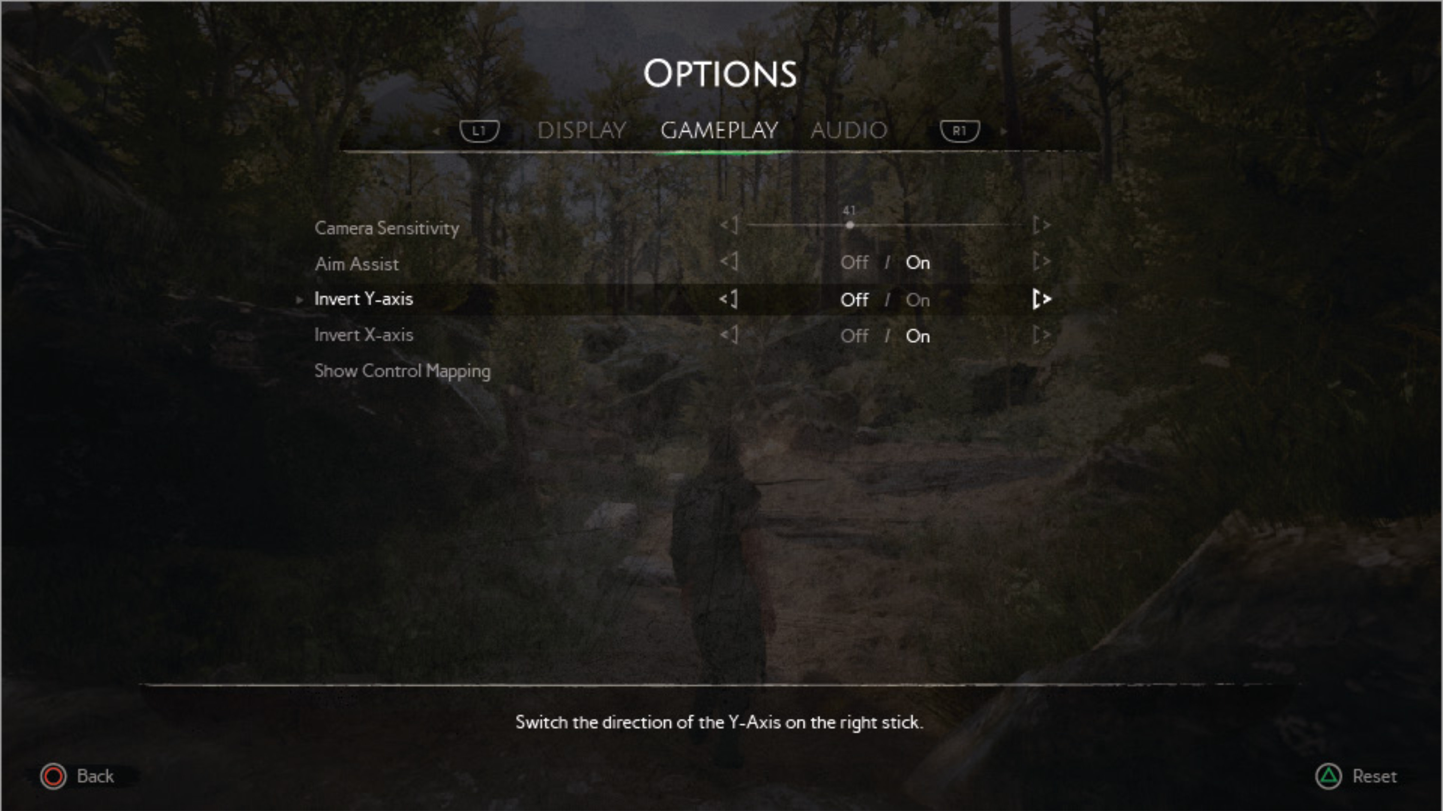
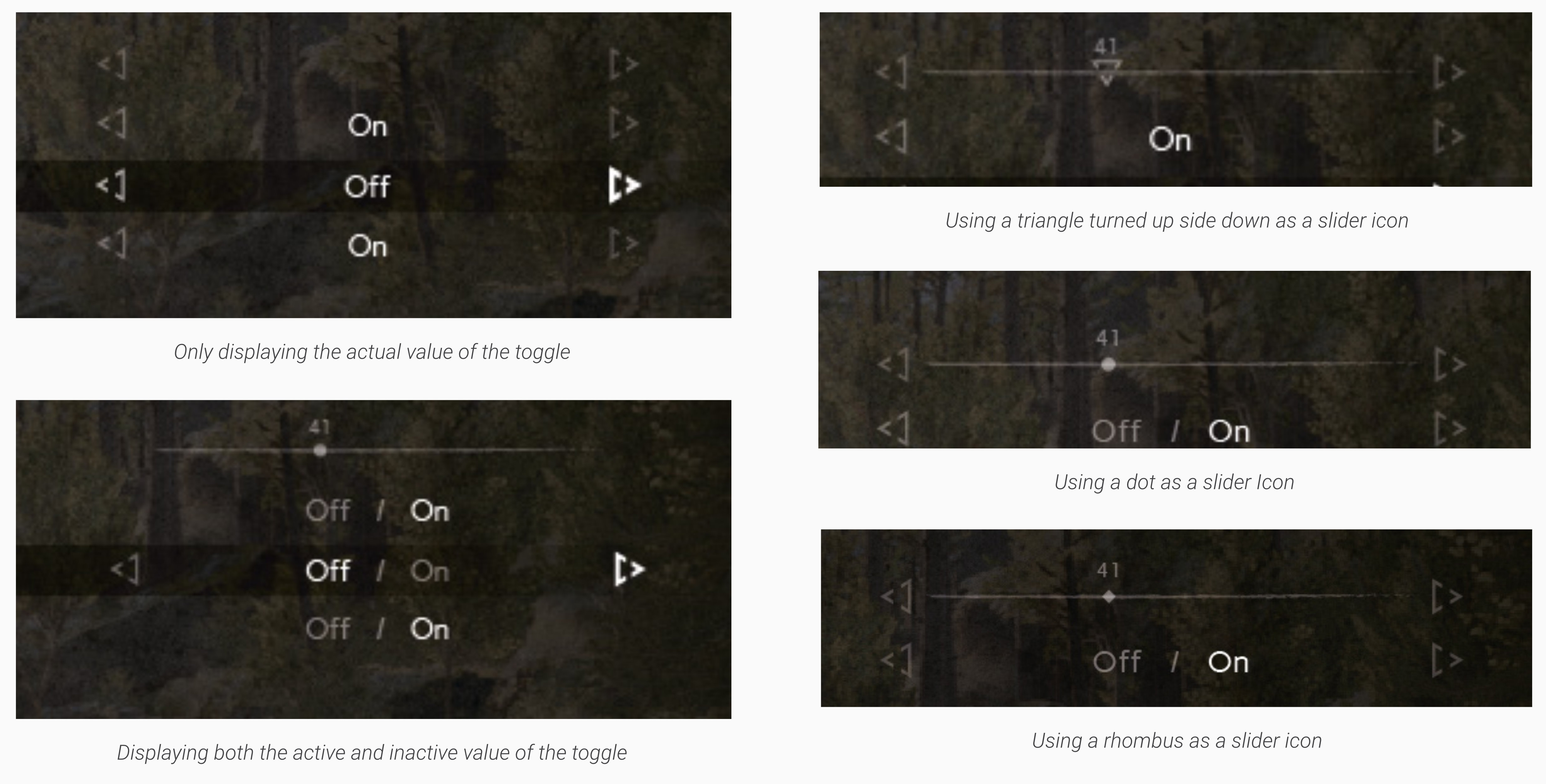
A few weeks before the end of development, the project shifted from a PlayStation 4 exclusive game to a PC-release. This shift in release platform, shifted the menu tasks in the last weeks from polish and animation to making sure that the menu was functional on a pc.
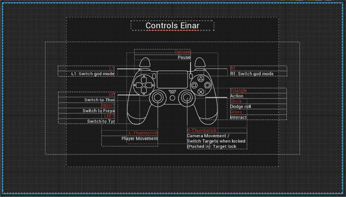
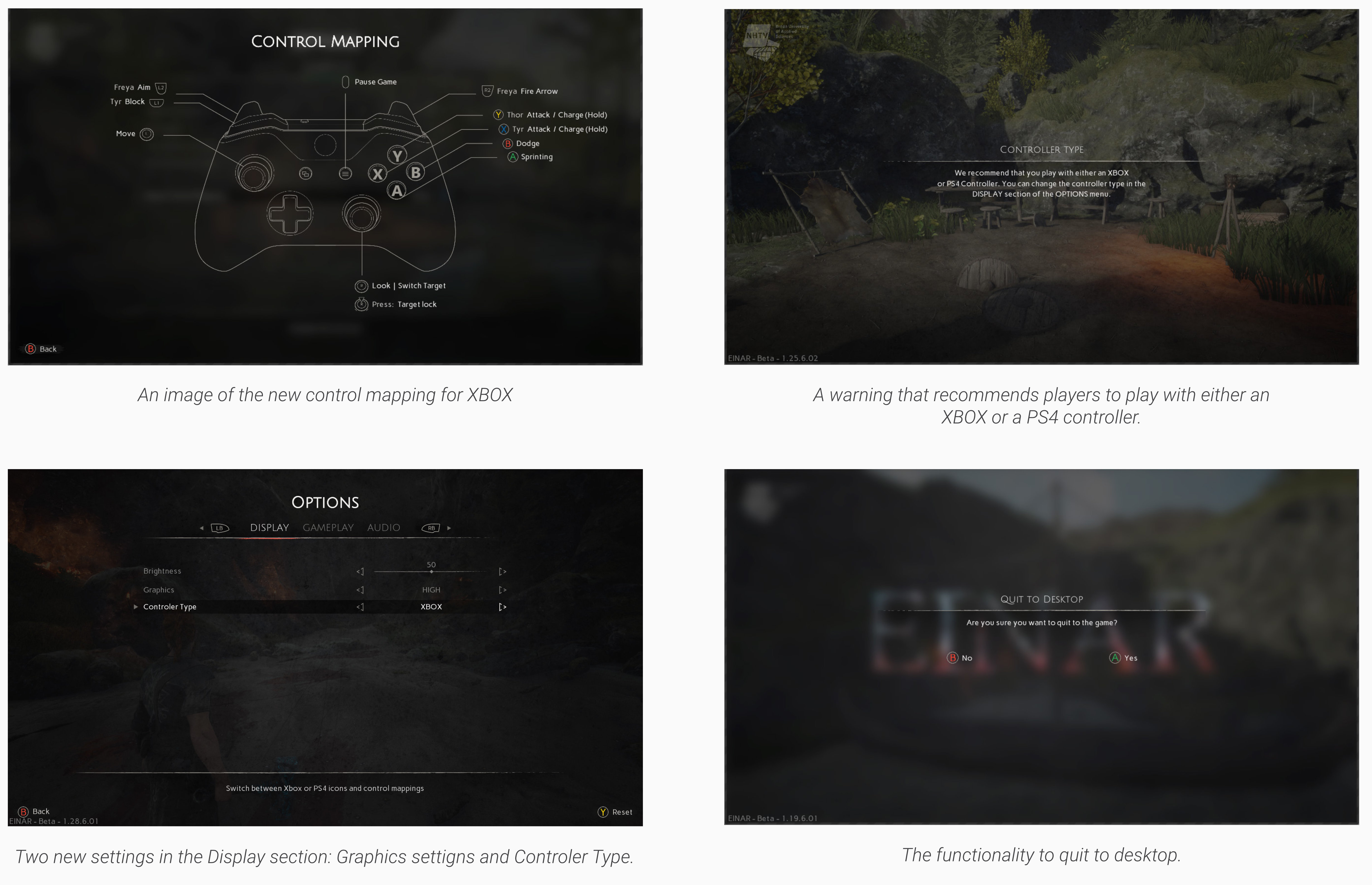
The user needed to be able to control the menu via a PS4 controller, XBOX controller and mouse and keyboard. This required extra menu screens, extra art, extra buttons and extra functionality.
A short reflection on the experiences of this project
The Einar project came with a lot of firsts for me. First time working as a technical artist for a game. First time working on a game menu, with the idea of actually becoming a UI developer. First time putting a lot more energy in the design side of a UI. First time working with such a big team on a relatively long project (compared to what I've done before).
All these firsts in Einar came with a lot of learning, time and energy. And when I look back at the result, that is what I see. A lot of would haves, could haves, frustrations but also success. A solid menu, that isn't cliche Viking but definitely has a Viking essence. Like the game, it has potential.